4.How did you use new media technologies in the construction and research, planning and evaluation stages?
Constuction Stage:
Like my AS studies I again used iMovie for the purpose of creating and editing my music video - from its rough cuts to the final product.
I used a range of of techniques to produce an interesting and stereotypical video for the unsigned band I chose, techniques such as;
-Speeding up and slowing down shots: I mainly slowed down shots as the song itself was sad and reminiscent, the speed of the shot when slowed down helped to make it more dramatic and emotional overall. I often sped up band shots so as the playing of the instruments was in sync with the music, I had to be careful not to speed them up too much or else it would look really unbelievable.
-Filters: As mentioned in my blog I used the filters, "Dream", "Bleach Bypass" and "Romantic" to represent different emotions felt in the song - portrayed by the lyrics. I used the "Dream" and "Romantic" filters to show (retrospectively) good memories between the couple that the singer still desperately clings to, whereas the "Bleach Bypass" was used upon present day clips to remove colour from the shots and demonstrate a lack of emotion.
I also used a filter that mirrored my clips to the original, this I chose to use so as to suggest a wider variety of clips rather than repeating them.
-Transitions: At certain points within my video I used two transitions - "Zoom" and "Cross Blur". I found the "Zoom" transition handy in quickening the change between shots, particularly when the pace of the song also quickened, in this sense I felt it fitted really well within the video even though transitions are not typical of music videos. I used "Cross Blur" to represent a change from present day shots to retrospective memories, combined with the filters used above I found this transition really effective in demonstrating this.
I of course also used an digital camera with an SD card, I found this very easy to film with and even easier when it came to uploading my footage. The only problem I found was that the cameras could not film portrait way, when I came to flipping this image round in iMovie it often slimmed the image down and it lost the quality, which was not what I wanted.
Research:
During my research stages I frequented many internet websites such as;
-MySpace: This was where I came across my chosen band "The Arrival", I found this site very useful in finding a range of unsigned artists. I was also able to listen to the tracks by my chosen artist on this website, this helped me to choose my favourite song and the one I felt most inclined to create a video for.
(To find the lyrics to my song I had to use an external music site, luckily I did not have to write them down by ear like some in my class!)
-YouTube: Here I started watching videos from the music video directors I was going to study (Jonze, Gondry, Cunningham) and chose three videos I liked best to evaluate.
YouTube was also very handy to find music videos done for other bands of similar style, I used a few of these as inspiration for my own.
-Wikipedia: This website helped greatly in my understanding of the four theories I have done (Voyeurism, Auteur, Godwin, Dyer) and therefore I could keep these in mind when creating my own video and then go on to explain where these theories came into use.
In my video evaluation posts I found Wikipedia useful in my understanding of the context of these videos and the influences the director had, this therefore helped in my evaluation of said videos.
-I also used many sites to find inspirational pictures for my digipak (Cover, Back, Inserts, Magazine Advert) which helped me arrange my band when it came to photgraphing them.
Planning:
Through my planning stages I again used iMovie, this time to create an animatic that would demonstrate the plan for my music video. I found this a good software to form the basis of my ideas and it also helped to order them.
Blogger itself helped me to order my thoughts and filming schedules so as I knew what I was doing, when and why.
Photoshop and iPhoto greatly helped me in designing and planning out my album covers and magazine advert, messing around with the effects on these softwares inspired me (along with other examples of albums) to design them the way I did.
Evaluation:
In my evaluation stages I did not really use any new media technologies to help as I used previous planning and research pages to explain why I chose things and what purpose they served in the music video world.
However to answer my evaluation question 2 I filmed my repsonse upon a digital camera and edited it in iMovie so as it made more sense and showed what I was describing upon my video.
Music Video Production
Here is my 2010/2011 blog showing the process of my creation of a music video.
Thursday, 12 May 2011
Evaluation Question 3
3.What have you learned from your audience feedback?
Positive:
-My class liked the idea of using the lead singer in most of my band shots as this reflected typical rock bands with voyeuristic lead males, although the rest of the band is shown they are not shown quite as intimately as the singer.
I have learnt from this technique that male lead singers do indeed entice a female (and possibly male) audience much more than the rest of the band.
My audience also began to feel pity for the lead singer because of the isolated shots, and by making "Maddie" seem heartless and uncaring in the break up scenes. The use of the filters was also mentioned to have helped this effect and the video to be quite emotional overall.

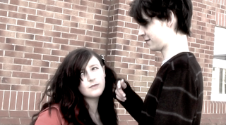
I learnt from this information that provoking sympathy for the lead singer also caused the audience to side with him - again a voyeuristic image.
Here is a video of some examples of shots that my class particularly liked and which I therefore kept in my final video:
-Feedback on my digipak was as follows; my class really liked the front cover of my album as they felt it was eye catching and greatly reflective of the "fun" personality I wanted to show my band as. I learnt that to appeal to a target audience of a certain age, appealing to what they expect the band to be like, or showing them how they really are, is often the best policy.
-My Magazine advert also received positive criticisms from my peers, they felt it was clear, noticeable and that the picture used was very generic of band photography. I found that the clearer and less complicated the font the more people preferred it as they still got the information they required to know. The use of the picture I also learnt helps an audience to instantly recognise the advert and who it is about.
Negative:
After showing my video to my class I received quite a bit of criticism for my video;
-In particular my miming was off in some areas and I therefore fixed this so as to make my video more realistic and believable in this sense, because good music videos obviously make the sync between soundtrack and video precise so as to look professional.
-Another main problem with some of my shots was that when I filmed shots of Sam miming I found that you could see the "Drummer" in the background but he was not playing, it therefore caused the shot to lose realism. Here is an example of what I mean :
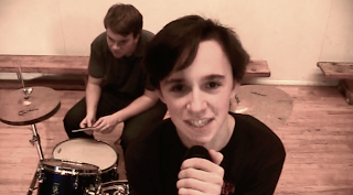
Instead of refilming the shot I overcame this problem by using the "Kens Burn" function on iMovie and got the shot to appear as if the camera is zooming in on the singer, this made the background smaller and the people in the foreground (Sam) closer to the camera causing there to be more focus on him than anything else in the shot. Hopefully this means that when people watch my video they will not notice this mistake.
-My class also found some of my shots slightly repetitive, to overcome this I filmed more narrative to work into my video to make it more interesting overall. I found this helped to make my video more memorable, therefore suggesting the more unique and interestingly filmed videos are makes them easier to remember.
Here are some screen shots of stills from my video, these shots I refilmed to help make my video more interesting and keep the audiences attention. My class welcomed these new shots positively because they felt they created strong emotions in the video and made it overall less repetitive:
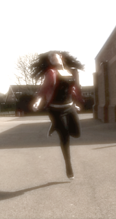
Shot one - This shot was liked because it added a dream-like and magical element to the memory displayed and it therefore fitted with the context it was in. The filter placed upon it also enhanced the effect I was trying to portray.
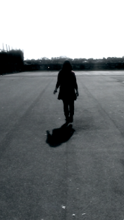
Shot two - This shot was liked for the silhouetted effect on the figure, this combined with the person walking away from the camera made the scene feel sad and lonely.

Shot three - This shot was liked for its abstract nature, the use of shadows could be interpreted as showing what the couple once were to what they are now.
All three shots received positive feedback for their unique and interesting nature.
Positive:
-My class liked the idea of using the lead singer in most of my band shots as this reflected typical rock bands with voyeuristic lead males, although the rest of the band is shown they are not shown quite as intimately as the singer.
I have learnt from this technique that male lead singers do indeed entice a female (and possibly male) audience much more than the rest of the band.
My audience also began to feel pity for the lead singer because of the isolated shots, and by making "Maddie" seem heartless and uncaring in the break up scenes. The use of the filters was also mentioned to have helped this effect and the video to be quite emotional overall.


I learnt from this information that provoking sympathy for the lead singer also caused the audience to side with him - again a voyeuristic image.
Here is a video of some examples of shots that my class particularly liked and which I therefore kept in my final video:
-Feedback on my digipak was as follows; my class really liked the front cover of my album as they felt it was eye catching and greatly reflective of the "fun" personality I wanted to show my band as. I learnt that to appeal to a target audience of a certain age, appealing to what they expect the band to be like, or showing them how they really are, is often the best policy.
-My Magazine advert also received positive criticisms from my peers, they felt it was clear, noticeable and that the picture used was very generic of band photography. I found that the clearer and less complicated the font the more people preferred it as they still got the information they required to know. The use of the picture I also learnt helps an audience to instantly recognise the advert and who it is about.
Negative:
After showing my video to my class I received quite a bit of criticism for my video;
-In particular my miming was off in some areas and I therefore fixed this so as to make my video more realistic and believable in this sense, because good music videos obviously make the sync between soundtrack and video precise so as to look professional.
-Another main problem with some of my shots was that when I filmed shots of Sam miming I found that you could see the "Drummer" in the background but he was not playing, it therefore caused the shot to lose realism. Here is an example of what I mean :

Instead of refilming the shot I overcame this problem by using the "Kens Burn" function on iMovie and got the shot to appear as if the camera is zooming in on the singer, this made the background smaller and the people in the foreground (Sam) closer to the camera causing there to be more focus on him than anything else in the shot. Hopefully this means that when people watch my video they will not notice this mistake.
-My class also found some of my shots slightly repetitive, to overcome this I filmed more narrative to work into my video to make it more interesting overall. I found this helped to make my video more memorable, therefore suggesting the more unique and interestingly filmed videos are makes them easier to remember.
Here are some screen shots of stills from my video, these shots I refilmed to help make my video more interesting and keep the audiences attention. My class welcomed these new shots positively because they felt they created strong emotions in the video and made it overall less repetitive:

Shot one - This shot was liked because it added a dream-like and magical element to the memory displayed and it therefore fitted with the context it was in. The filter placed upon it also enhanced the effect I was trying to portray.

Shot two - This shot was liked for the silhouetted effect on the figure, this combined with the person walking away from the camera made the scene feel sad and lonely.

Shot three - This shot was liked for its abstract nature, the use of shadows could be interpreted as showing what the couple once were to what they are now.
All three shots received positive feedback for their unique and interesting nature.
Evaluation Question 1
1.In what ways does your media product use, develop or challenge forms and conventions of real media products?
Here are a few screen shots of selected music videos that formed the basis of my research into the rock genre:
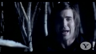
Shot One is a picture of one of the lead singers in Mayday Parade (Miserable at Best). I have used this example earlier on in my blog as I feel this video truly reflects the narrative style I was going for in my own.
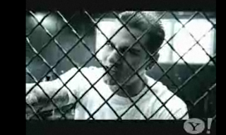
Shot Two is a picture of the lead singer of Avenged Sevenfold (Seize the Day). The blue filter and dark lighting suggests a more grungy style of music as well as his appearance overall with the black clothing and tattoos.

Shot Three is a picture of the lead singer in All Time Low (Weightless). A shot of a seemingly voyeuristic male singer whom is wearing a popular style for this era, his hair also reflects his modern look as this hairstyle seems a generic look for boy rock bands.
During my music video I attempted in centring the band shots around the lead singer (Sam) much like these bands have done. Again, like I explained, I am using this technique voyeuristically - probably what 'All Time Low' did also. I learnt from looking at these bands that it is very typical of them to include a lead singer, guitarist, bassist, and drummer - hence my band's line up, I wanted to demonstrate a generic style of rock band.
I created empathy for the lead singer through my video, the girl (Maddie) is suggested to be the one who breaks Sam's heart and he is left feeling alone and upset - as the song lyrics would connote.
The use of an urban setting I feel would help the audience relate to the scene being displayed, rather than it being set in a high budget location like Peter Andre's "Mysterious Girl" as rock bands are less extravagant than pop singers.
I also managed to do this by not showing the band performing in front of a huge crowd, as they are a new band completely this would not be realistic as their fan base would not be that large, I also felt that idolising them in the video would detract meaning away from my narrative - however this was successful in Avril Lavigne's video "Losing Grip", but there was very minimal narrative and it was involved in the performance shots.
Through costume I managed to achieve a believable brand identity for my band, I feel their clothing overall was not too dark (like Avenged Sevenfold) but not too formal (like Mayday Parade), the happy medium between the two gave a youthful look and style that my target audience could relate to. However I felt I developed this further by letting the band wear the clothes they felt comfortable in rather than to create an identity for themselves, this idea I felt helped make the band seem down to earth and just like anyone in their target audience.
I felt that my music video used many form and conventions of real life products, in particular the use of the generic narrative of a couple breaking up, reminiscing etc, however I also felt this was evident through my style of band shots I used as I tried to incorporate each member equally (after the lead singer) where possible. I also kept the shots of the band intimate so as an audience can see what they are doing and how they are playing, I flicked between band members quickly to suggest a hectic scene when the pace of the song quickened, this is evident in the example band above 'All Time Low'.
Here are some examples of band shots I used, note that the singer is usually the band member that has his face displayed to the camera with a direct mode of address:

I felt these shots of Sam greatly reflected conventions of boy band singers and their direct modes of address, this technique greatly appeals to audiences as it feels as though the singer is singing directly to them.
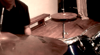
This shot of the drummer I felt was more abstract than typical shots of this band member. The others shots of the drummer I have in the video I feel are very typical and generic shots, even the positioning of the drummer at the back of the band reflects real life bands, for example Lost Prophets, Mayday Parade etc.
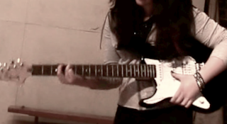
The guitar shot here is incredibly stereotypical, the clothing of Maddie, the stance she is in, all of which demonstrate a keen guitarist who is completely involved in the music. A lot of these shots were often done to show the guitarist playing rather than the guitarist herself.
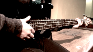
Similar to the guitar shots were that of the bass guitar, as both have a similar role in a band I had less diversity with the shots of these instruments.
In my digipak I felt my front cover challenged conventions incredibly as it is a rarity to see the band on the front cover - it is nearly always digital album art or a surreal photograph. The challenging of current media products I felt made my cover, and band, stand out against the rest as it is not so cliche. The back cover on the other hand I used to reflect the band's genre by the image of the guitar head, and I therefore feel this does not challenge conventions but merely adds to them in the sense that an album is there to represent a band's identity - whereas my front cover does not necessarily establish that connection.
The magazine advert I created I feel uses typical conventions of bands and how they are usually photographed - the lead singer in the spotlight!
Here is the original photo I used and some experimental photos that follow the same style but which I eventually rejected:
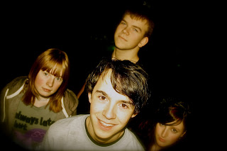
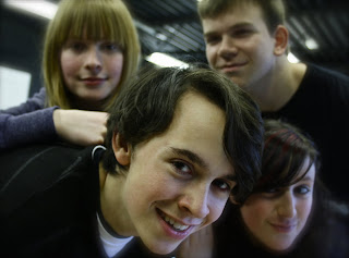
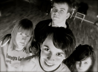
From band photos in magazines to how they are portrayed on front covers of magazines such as NME, I took inspiration from these and the arrangement of the members and tested this out for myself. My band photo reflects the style in which bands are displayed to a target audience, the central positioning of the photo in the advert suggests they are of importance, especially as this is the first thing an audience would see (before the writing)when getting to the page the advert is on. I feel the photo used is also memorable so if the same audience were to see them again they would recognise them and feel more attached to them because of this.
Here are a few screen shots of selected music videos that formed the basis of my research into the rock genre:

Shot One is a picture of one of the lead singers in Mayday Parade (Miserable at Best). I have used this example earlier on in my blog as I feel this video truly reflects the narrative style I was going for in my own.

Shot Two is a picture of the lead singer of Avenged Sevenfold (Seize the Day). The blue filter and dark lighting suggests a more grungy style of music as well as his appearance overall with the black clothing and tattoos.

Shot Three is a picture of the lead singer in All Time Low (Weightless). A shot of a seemingly voyeuristic male singer whom is wearing a popular style for this era, his hair also reflects his modern look as this hairstyle seems a generic look for boy rock bands.
During my music video I attempted in centring the band shots around the lead singer (Sam) much like these bands have done. Again, like I explained, I am using this technique voyeuristically - probably what 'All Time Low' did also. I learnt from looking at these bands that it is very typical of them to include a lead singer, guitarist, bassist, and drummer - hence my band's line up, I wanted to demonstrate a generic style of rock band.
I created empathy for the lead singer through my video, the girl (Maddie) is suggested to be the one who breaks Sam's heart and he is left feeling alone and upset - as the song lyrics would connote.
The use of an urban setting I feel would help the audience relate to the scene being displayed, rather than it being set in a high budget location like Peter Andre's "Mysterious Girl" as rock bands are less extravagant than pop singers.
I also managed to do this by not showing the band performing in front of a huge crowd, as they are a new band completely this would not be realistic as their fan base would not be that large, I also felt that idolising them in the video would detract meaning away from my narrative - however this was successful in Avril Lavigne's video "Losing Grip", but there was very minimal narrative and it was involved in the performance shots.
Through costume I managed to achieve a believable brand identity for my band, I feel their clothing overall was not too dark (like Avenged Sevenfold) but not too formal (like Mayday Parade), the happy medium between the two gave a youthful look and style that my target audience could relate to. However I felt I developed this further by letting the band wear the clothes they felt comfortable in rather than to create an identity for themselves, this idea I felt helped make the band seem down to earth and just like anyone in their target audience.
I felt that my music video used many form and conventions of real life products, in particular the use of the generic narrative of a couple breaking up, reminiscing etc, however I also felt this was evident through my style of band shots I used as I tried to incorporate each member equally (after the lead singer) where possible. I also kept the shots of the band intimate so as an audience can see what they are doing and how they are playing, I flicked between band members quickly to suggest a hectic scene when the pace of the song quickened, this is evident in the example band above 'All Time Low'.
Here are some examples of band shots I used, note that the singer is usually the band member that has his face displayed to the camera with a direct mode of address:

I felt these shots of Sam greatly reflected conventions of boy band singers and their direct modes of address, this technique greatly appeals to audiences as it feels as though the singer is singing directly to them.

This shot of the drummer I felt was more abstract than typical shots of this band member. The others shots of the drummer I have in the video I feel are very typical and generic shots, even the positioning of the drummer at the back of the band reflects real life bands, for example Lost Prophets, Mayday Parade etc.

The guitar shot here is incredibly stereotypical, the clothing of Maddie, the stance she is in, all of which demonstrate a keen guitarist who is completely involved in the music. A lot of these shots were often done to show the guitarist playing rather than the guitarist herself.

Similar to the guitar shots were that of the bass guitar, as both have a similar role in a band I had less diversity with the shots of these instruments.
In my digipak I felt my front cover challenged conventions incredibly as it is a rarity to see the band on the front cover - it is nearly always digital album art or a surreal photograph. The challenging of current media products I felt made my cover, and band, stand out against the rest as it is not so cliche. The back cover on the other hand I used to reflect the band's genre by the image of the guitar head, and I therefore feel this does not challenge conventions but merely adds to them in the sense that an album is there to represent a band's identity - whereas my front cover does not necessarily establish that connection.
The magazine advert I created I feel uses typical conventions of bands and how they are usually photographed - the lead singer in the spotlight!
Here is the original photo I used and some experimental photos that follow the same style but which I eventually rejected:


From band photos in magazines to how they are portrayed on front covers of magazines such as NME, I took inspiration from these and the arrangement of the members and tested this out for myself. My band photo reflects the style in which bands are displayed to a target audience, the central positioning of the photo in the advert suggests they are of importance, especially as this is the first thing an audience would see (before the writing)when getting to the page the advert is on. I feel the photo used is also memorable so if the same audience were to see them again they would recognise them and feel more attached to them because of this.
Tuesday, 10 May 2011
The Music and Music Video Industry
Music Industry:
The music industry or music business sells compositions, recordings and performances of music, such as my piece.
Among the many individuals and organizations that operate within the industry are the musicians who compose and perform the music;
- the companies and professionals who create and sell recorded music (e.g., music publishers, producers, studios, engineers, record labels, retail and online music stores, performance rights organisations)
- those that present live music performances (booking agents, promoters, music venues, road crew)
- professionals who assist musicians with their careers (talent managers, business managers, entertainment lawyers)
- those who broadcast music (satellite and broadcast radio)
- journalists
- educators
- musical instrument manufacturers etc
Four "major corporate labels" dominate recorded music:
- Universal Music Group
- Sony Music Entertainment
- Warner Music Group
- EMI
"In the 21st century, consumers spent less money on recorded music than they had in 1990s, in all formats."
A successful artist functions in the market as a brand and, as such, may derive income from many other streams, such as merchandise or internet-based services. These are typically overseen by the artist's manager and take the form of relationships between the artist and companies that specialise in these products.
Music Video Industry:
"The Music Video Industry represents a combination of film and video as an art form and film and video as a marketing tool. Whether a large scale, big budget production, or an independently produced piece, a music video advertises the talents of both filmmakers and musicians."
(Budgets for music videos range from homemade videos which cost a fe hundred quid all the way to the most expensive video ever made "Scream" by Michael and Janet Jackson which cost 7 million dollars. Average video cost is about £500,000 to £1,000,000.)
DVDs of music videos sell in 2 different forms in retail outlets.
The first is in a video compilation by either the label, or by the director or the artist. Spike Jonze, Michel Gondry and Chris Cunningham are all directors who have successfully sold their work in the dvd format.
Internet sales of music videos is a relatively new channel that has come to profitability with the popularity of broadband in the home and the invention of the video iPod. iTunes sells videos, which they used to offer for free, now for your home computer and iPod.
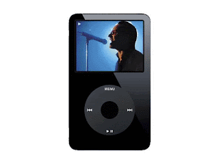
the Internet has become a powerful tool for both the filmmakers and the musicians to market their videos. Many smaller bands are able to make videos due to the accessibility of digital cameras and editing software, and can thus put these pieces on their websites or forums such as My Space. Bands can also send these videos the labels in hopes of getting a contract. The internet is also a valuable tool for aspiring music video makers, as there are countless resources available with tips for every aspect of the video-making process.
The music video industry has undergone many changes in the past decade or so, as video-making has become more accessible and less expensive and the market landscape has evolved. More video channels have emerged with the expansion of cable programming. However, the two most well known channels, MTV and VH1, play less videos and rather focus on dramatic and reality television.
The music industry or music business sells compositions, recordings and performances of music, such as my piece.
Among the many individuals and organizations that operate within the industry are the musicians who compose and perform the music;
- the companies and professionals who create and sell recorded music (e.g., music publishers, producers, studios, engineers, record labels, retail and online music stores, performance rights organisations)
- those that present live music performances (booking agents, promoters, music venues, road crew)
- professionals who assist musicians with their careers (talent managers, business managers, entertainment lawyers)
- those who broadcast music (satellite and broadcast radio)
- journalists
- educators
- musical instrument manufacturers etc
Four "major corporate labels" dominate recorded music:
- Universal Music Group
- Sony Music Entertainment
- Warner Music Group
- EMI
"In the 21st century, consumers spent less money on recorded music than they had in 1990s, in all formats."
A successful artist functions in the market as a brand and, as such, may derive income from many other streams, such as merchandise or internet-based services. These are typically overseen by the artist's manager and take the form of relationships between the artist and companies that specialise in these products.
Music Video Industry:
"The Music Video Industry represents a combination of film and video as an art form and film and video as a marketing tool. Whether a large scale, big budget production, or an independently produced piece, a music video advertises the talents of both filmmakers and musicians."
(Budgets for music videos range from homemade videos which cost a fe hundred quid all the way to the most expensive video ever made "Scream" by Michael and Janet Jackson which cost 7 million dollars. Average video cost is about £500,000 to £1,000,000.)
DVDs of music videos sell in 2 different forms in retail outlets.
The first is in a video compilation by either the label, or by the director or the artist. Spike Jonze, Michel Gondry and Chris Cunningham are all directors who have successfully sold their work in the dvd format.
Internet sales of music videos is a relatively new channel that has come to profitability with the popularity of broadband in the home and the invention of the video iPod. iTunes sells videos, which they used to offer for free, now for your home computer and iPod.

the Internet has become a powerful tool for both the filmmakers and the musicians to market their videos. Many smaller bands are able to make videos due to the accessibility of digital cameras and editing software, and can thus put these pieces on their websites or forums such as My Space. Bands can also send these videos the labels in hopes of getting a contract. The internet is also a valuable tool for aspiring music video makers, as there are countless resources available with tips for every aspect of the video-making process.
The music video industry has undergone many changes in the past decade or so, as video-making has become more accessible and less expensive and the market landscape has evolved. More video channels have emerged with the expansion of cable programming. However, the two most well known channels, MTV and VH1, play less videos and rather focus on dramatic and reality television.
Friday, 6 May 2011
Editing and its Process
Effects and Filters:
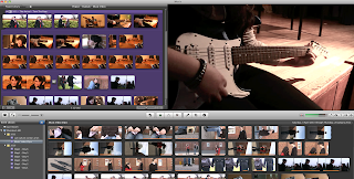
Like my AS studies I again used iMovie for editing my music video, however this time we did not need to use Garageband as we already had a soundtrack.
I found iMovie again easy and accessible to use for editing, however this time I found the problem of unwanted background noise invading some of my clips, even if they were muted, and I could not seem to get rid of this even after reediting the clips with said problem.
Filters:
For some of my scenes where the couple are together I varied between using "Romantic" and "Dream" filters to represent a dream like memory state, here are some examples:
Both of these are examples of the "Dream" filter which helped to make the scene brighter and happier and fitted with the slow speed of both these clips.

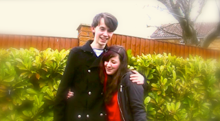
These are examples of clips with the "Romantic" filter on, again to represent a happy memory. This filter helped to blur the edges making the couple the main focus of the scene and helping the audience to perceive this to be a memory/dream.
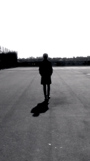
Here a "Bleach Bypass" was used to represent the emotions of the scene, however the silhouetting created here from the filter makes the singer (Sam) seem more isolated and lonely so I decided to keep this effect.

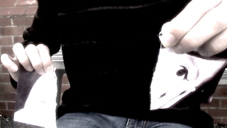
Here it was used to remove a lot of the colour from the clip to reflect the sad emotions of the singer - he himself feels emotionless. I feel this filter was very useful in the effect I wanted to create.
I believe the contrast in the use of these filters emphasises the conflict of emotions the singer is feeling - this is what I wanted to convey to the audience.
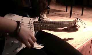
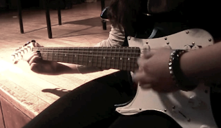
Here I am demonstrating the use of a 'Mirror' filter to flip the clip round, I have chosen to do this to make for more interesting clips. I like the effect this filter portrays when the clips are placed next to each other, it allows for a dizzy and chaotic scene like I achieved with the repetition of the symbols being hit.
Editing:
Here is an example of some clips I used the technique of "Kens Burn" upon, I found this to be useful as it allowed me easily to be able to smoothly zoom in on a clip without having to use the camera to do so.
I often found that when I tried to zoom in on the camera I couldn't achieve it at a constant speed so it looked messy and unsteady, this editing technique was a handy alternative.
I used zoom-ins such as these to highlight a point in the scene, for example shot two is to draw the attention to the couple holding hands rather than the couple itself, whereas shot one is to bring focus upon the singer (voyeurism)
Like my AS studies I again used iMovie for editing my music video, however this time we did not need to use Garageband as we already had a soundtrack.
I found iMovie again easy and accessible to use for editing, however this time I found the problem of unwanted background noise invading some of my clips, even if they were muted, and I could not seem to get rid of this even after reediting the clips with said problem.

Filters:
For some of my scenes where the couple are together I varied between using "Romantic" and "Dream" filters to represent a dream like memory state, here are some examples:
Both of these are examples of the "Dream" filter which helped to make the scene brighter and happier and fitted with the slow speed of both these clips.


These are examples of clips with the "Romantic" filter on, again to represent a happy memory. This filter helped to blur the edges making the couple the main focus of the scene and helping the audience to perceive this to be a memory/dream.

Here a "Bleach Bypass" was used to represent the emotions of the scene, however the silhouetting created here from the filter makes the singer (Sam) seem more isolated and lonely so I decided to keep this effect.


Here it was used to remove a lot of the colour from the clip to reflect the sad emotions of the singer - he himself feels emotionless. I feel this filter was very useful in the effect I wanted to create.
I believe the contrast in the use of these filters emphasises the conflict of emotions the singer is feeling - this is what I wanted to convey to the audience.


Here I am demonstrating the use of a 'Mirror' filter to flip the clip round, I have chosen to do this to make for more interesting clips. I like the effect this filter portrays when the clips are placed next to each other, it allows for a dizzy and chaotic scene like I achieved with the repetition of the symbols being hit.
Editing:
Here is an example of some clips I used the technique of "Kens Burn" upon, I found this to be useful as it allowed me easily to be able to smoothly zoom in on a clip without having to use the camera to do so.
I often found that when I tried to zoom in on the camera I couldn't achieve it at a constant speed so it looked messy and unsteady, this editing technique was a handy alternative.
I used zoom-ins such as these to highlight a point in the scene, for example shot two is to draw the attention to the couple holding hands rather than the couple itself, whereas shot one is to bring focus upon the singer (voyeurism)
Thursday, 7 April 2011
Music Video - Final Cut
Here is the final cut of my music video.
Feedback:
My class feel I have achieved what I set out to make, they feel the shots fit really well with the narrative and genre and that pace is used appropriately throughout.
My class particularly like the filters I have used and after explaining why I used them they feel they work for the image I was trying to portray.
What do you think are the strengths of your music video?
I believe the pace of my shots with the music is a strength of my video, instead of distracting the viewer from the music it enhances the meaning behind the lyrics. I am also very fond of the transitions that demonstrate either a quickening in pace or a blur to signify a flashback/memory.
I also feel the contrast of filters on scenes works well. The "bleach bypass" filter I used for the sad scenes as it removed most of the colour from the shot conveying the emotions of the singer to the audience. This I contrasted with the use of "romantic" and "dream" filters to show positive flash backs of what the couple once were, I also found that the "dream" filter made the shot less sharp and I decided to keep this to reflect as fuzzy memory.
What do you think are the weaknesses?
I feel my band shots may be slightly repetitive and this could be boring for the audience to watch, I tried to overcome this by mirroring shots and only playing them for split seconds so as I could show my narrative instead. I also feel some of the performance shots aren't in sync with the music but this is because the people playing could not play instruments at all.
I also feel some of the shots do not run smoothly with the entire video and look as if I have just placed them at random, if I were to do this next time I would make sure the shots work well together and re-film anything I needed to do again.
Similarities to my Animatic and Pitch:
Like my pitch and animatic I kept the idea of a couple separating and tried to get across the negative emotions of the boyfriend through shots of him being alone.
I also kept the idea of using a photo album (and photos) to represent memories and the inability to let go of what you once had.
Differences:
Although I kept in the idea of the photo album I decided not to use it as the main focus of my video because I thought it would get too repetitive, I also chose not to use the idea of the photo turning into a real clip as this was too tedious and I found other shots I preferred.
Whilst messing around with the filters on iMovie I also decided to include the use of these as well as some transitions to make the video more interesting to watch.
Subscribe to:
Comments (Atom)