Here are a few screen shots of selected music videos that formed the basis of my research into the rock genre:
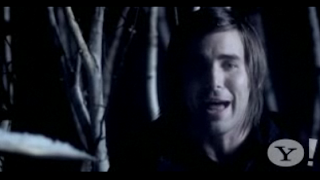
Shot One is a picture of one of the lead singers in Mayday Parade (Miserable at Best). I have used this example earlier on in my blog as I feel this video truly reflects the narrative style I was going for in my own.
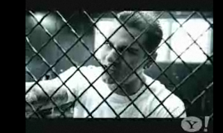
Shot Two is a picture of the lead singer of Avenged Sevenfold (Seize the Day). The blue filter and dark lighting suggests a more grungy style of music as well as his appearance overall with the black clothing and tattoos.
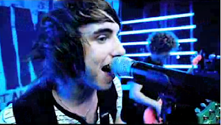
Shot Three is a picture of the lead singer in All Time Low (Weightless). A shot of a seemingly voyeuristic male singer whom is wearing a popular style for this era, his hair also reflects his modern look as this hairstyle seems a generic look for boy rock bands.
During my music video I attempted in centring the band shots around the lead singer (Sam) much like these bands have done. Again, like I explained, I am using this technique voyeuristically - probably what 'All Time Low' did also. I learnt from looking at these bands that it is very typical of them to include a lead singer, guitarist, bassist, and drummer - hence my band's line up, I wanted to demonstrate a generic style of rock band.
I created empathy for the lead singer through my video, the girl (Maddie) is suggested to be the one who breaks Sam's heart and he is left feeling alone and upset - as the song lyrics would connote.
The use of an urban setting I feel would help the audience relate to the scene being displayed, rather than it being set in a high budget location like Peter Andre's "Mysterious Girl" as rock bands are less extravagant than pop singers.
I also managed to do this by not showing the band performing in front of a huge crowd, as they are a new band completely this would not be realistic as their fan base would not be that large, I also felt that idolising them in the video would detract meaning away from my narrative - however this was successful in Avril Lavigne's video "Losing Grip", but there was very minimal narrative and it was involved in the performance shots.
Through costume I managed to achieve a believable brand identity for my band, I feel their clothing overall was not too dark (like Avenged Sevenfold) but not too formal (like Mayday Parade), the happy medium between the two gave a youthful look and style that my target audience could relate to. However I felt I developed this further by letting the band wear the clothes they felt comfortable in rather than to create an identity for themselves, this idea I felt helped make the band seem down to earth and just like anyone in their target audience.
I felt that my music video used many form and conventions of real life products, in particular the use of the generic narrative of a couple breaking up, reminiscing etc, however I also felt this was evident through my style of band shots I used as I tried to incorporate each member equally (after the lead singer) where possible. I also kept the shots of the band intimate so as an audience can see what they are doing and how they are playing, I flicked between band members quickly to suggest a hectic scene when the pace of the song quickened, this is evident in the example band above 'All Time Low'.
Here are some examples of band shots I used, note that the singer is usually the band member that has his face displayed to the camera with a direct mode of address:

I felt these shots of Sam greatly reflected conventions of boy band singers and their direct modes of address, this technique greatly appeals to audiences as it feels as though the singer is singing directly to them.
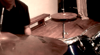
This shot of the drummer I felt was more abstract than typical shots of this band member. The others shots of the drummer I have in the video I feel are very typical and generic shots, even the positioning of the drummer at the back of the band reflects real life bands, for example Lost Prophets, Mayday Parade etc.
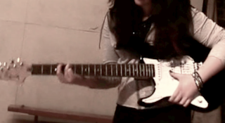
The guitar shot here is incredibly stereotypical, the clothing of Maddie, the stance she is in, all of which demonstrate a keen guitarist who is completely involved in the music. A lot of these shots were often done to show the guitarist playing rather than the guitarist herself.
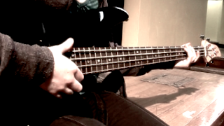
Similar to the guitar shots were that of the bass guitar, as both have a similar role in a band I had less diversity with the shots of these instruments.
In my digipak I felt my front cover challenged conventions incredibly as it is a rarity to see the band on the front cover - it is nearly always digital album art or a surreal photograph. The challenging of current media products I felt made my cover, and band, stand out against the rest as it is not so cliche. The back cover on the other hand I used to reflect the band's genre by the image of the guitar head, and I therefore feel this does not challenge conventions but merely adds to them in the sense that an album is there to represent a band's identity - whereas my front cover does not necessarily establish that connection.
The magazine advert I created I feel uses typical conventions of bands and how they are usually photographed - the lead singer in the spotlight!
Here is the original photo I used and some experimental photos that follow the same style but which I eventually rejected:
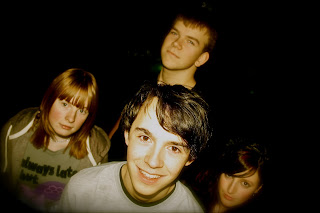
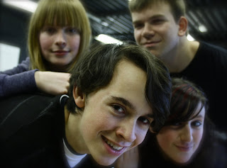
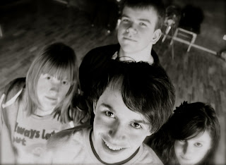
From band photos in magazines to how they are portrayed on front covers of magazines such as NME, I took inspiration from these and the arrangement of the members and tested this out for myself. My band photo reflects the style in which bands are displayed to a target audience, the central positioning of the photo in the advert suggests they are of importance, especially as this is the first thing an audience would see (before the writing)when getting to the page the advert is on. I feel the photo used is also memorable so if the same audience were to see them again they would recognise them and feel more attached to them because of this.
No comments:
Post a Comment